top of page

Merlin Map
Type / Design / Illustration
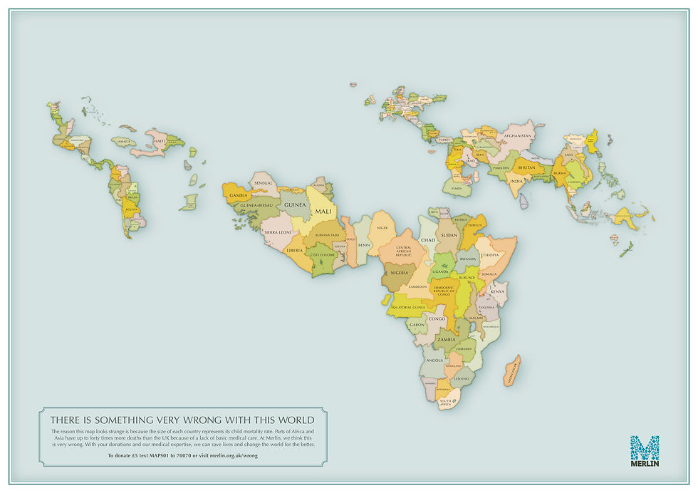
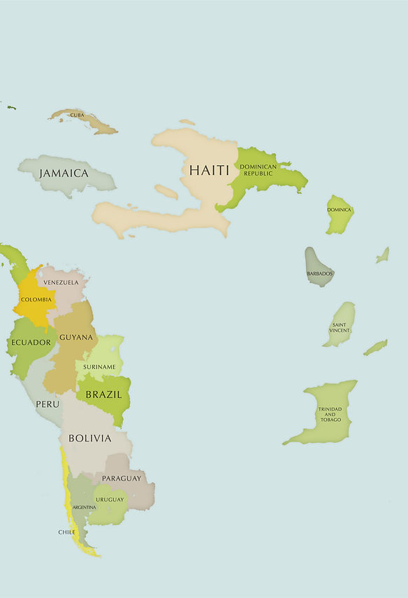
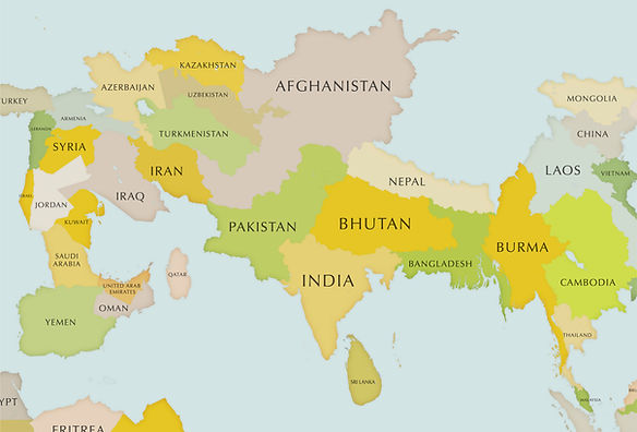
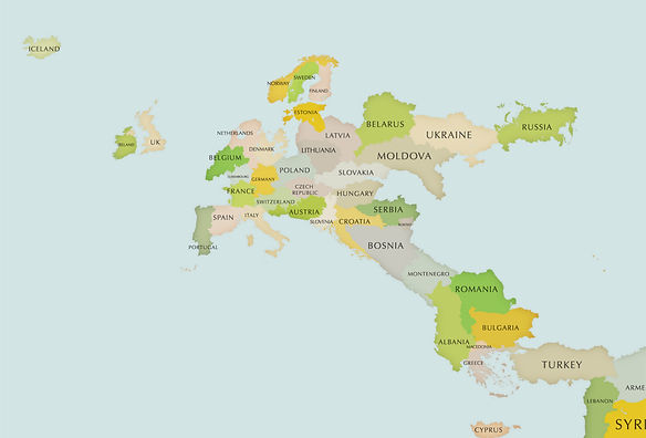
The reason this map looks strange is because the size of each country
is proportional to its child mortality rate. Parts of Africa and Asia have fifty times more deaths than the UK because of a lack of basic medical care.
At Merlin, we think this is very wrong. With your donations and our medical expertise, we can save lives and change the world for the better.
This map was produced with immense accuracy, we calculated
the size of each country then reduced them by the percentage of child mortality and then i put every single country back together in its
right place. probably took around 3 months in total to complete...


bottom of page